Data charting
For context, please read calling the API page before going through this page.
Implementing charts from scratch
Assuming you have already obtained the API credentials and were able to receive an API response with some data for a specific location, you may now also want to create charts with the percentiles that represent the full range of expected weather outcomes for that location in various warming scenarios. As described on the calling the API page, the variable values that you receive from the API contains 101 variables corresponding to the precentiles ranging from 0 to 100. Below you will find more information on how to use this variable to draw plots.
Let start with an example:
- Call the API to retreive data about Phoenix Arizona, United States.
- From this data we receive, let’s take “Days above 32°C” at 3°C of warming
- The
valuesarray contains the 101 percentiles and its value is:
const values = [122,137,140,142,144,146,148,149,151,152,152,153,153,154,155,156,158,158,159,160,160,160,161,162,162,162,163,164,164,164,166,166,167,167,168,168,169,169,170,170,170,171,171,171,171,172,174,174,175,176,177,177,179,180,180,181,181,182,183,184,185,186,186,187,188,190,192,193,193,193,193,195,197,198,199,199,200,200,200,202,203,204,204,206,207,207,208,208,208,209,212,215,216,218,220,222,224,227,232,234,236];
We can use this array to draw the x-axis of the plot.
- On the y-axis we use the likelihood data which is always:
const cumulativeProbability = [0, 1, 2, 3 ..., 100]. These values are inferred by the order of the values in the arrayvalues. ThecumulativeProbabilityvalues are not returned in the response. - How do we read this data? Since we now have two arrays,
valuesandcumulativeProbability, this means that experiencing less than values[i] days above 32°C has a chance of cumulativeProbability[i]%. Experiencing more than values[i] days has a chance of (100 - cumulativeProbability[i])%.
Example related to the above data:
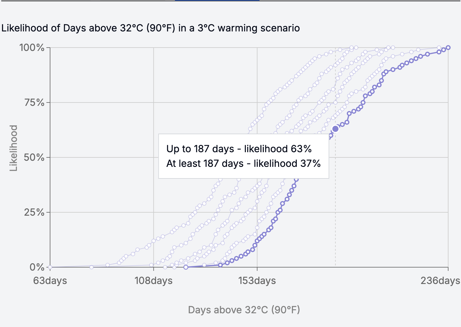
These 101 percentile values represent the range of days above 32°C expected in Phoenix Arizona in a 3°C warming scenario. In other words, in that location, and in a 3°C warming scenario, experiencing fewer than or equal to 187 days above 32°C has a chance of 63%. Experiencing more than or equal to 187 days has a chance of 37% (100 - 63). Experiencing more than or equal to 137 days has a 99% chance. Experiencing more than or equal to 234 days has a 1% chance.
The chart of this data will look like this. Each line corresponds to one warming scenario. The one highlighed is 3°C.

You may have noticed that some values inside the values array are repeated, e.g. 152 at indexes 9 and 10. What you can do in this case is to re-create the values and cumulativeProbability in a way that if one value has multiple likelihoods, select only one point(x, y) such that y is the max likelihood for x.
You can use the code that we already use in the Climate Factbook:
const selectMaxYForX = (stat => {
    const map = new Map<number, number>();
    // const cumulativeProbability = Array.from({ length: 101 }, (_, i) => i);
    stat.cumulativeProbability.forEach((y, index) => {
      const x = stat!.values[index];
      if (!map.has(x) || y > map.get(x)!) {
        map.set(x, y);
      }
    });

    return Array.from(map, ([x, y]) => ({ x, y }));
};
Adding charts as a React component
Rather than calling the API and creating your own charts, we’ve provided a Chart component that you can easily integrate into your React app. To import and use this component, simply follow the steps outlined below:
- Install the @probable-futures/probable-futures-maps npm package
- Import the
Chartcomponent and use it
Props:
- width (number, required)
- height (number, required)
- datasetStats (StatisticsData[], required): the stats that you receive after calling the API to get the climate data for a specific location (learn more about calling the API). Note that you can import that StatisticsData from
@probable-futures/lib - datasetId (number, required)
- warmingScenario (number, required) - supported values:
0.5 | 1 | 1.5 | 2 | 2.5 | 3 - hideTitle (boolean, optional): show or hide the title of the chart
- onLineClicked (Function): this event will fire whenever one of the chart lines is clicked
Example:
import { Chart } from "@probable-futures/probable-futures-maps";

const [selectedChartDegree, setSelectedChartDegree] = useState(0.5);

<Chart
  width={700}
  height={400}
  datasetStats={datasetStats}
  datasetId={40104}
  warmingScenario={selectedChartDegree}
  hideTitle
  onLineClicked={(degree) => setSelectedChartDegree(degree) }
/>